|
|
|
DAVID ABRAHAM — MEMPHIS COLLEGE OF ART |
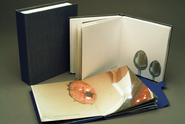
amelia bird — university of iowa
|
amelia bird — university of iowa
|
amelia bird — university of iowa
|
nikkila carroll —MEMPHIS COLLEGE OF ART
|
nikkila carroll —MEMPHIS COLLEGE OF ART
|
sarah joanne bromley —center for creative studies, detroit
|
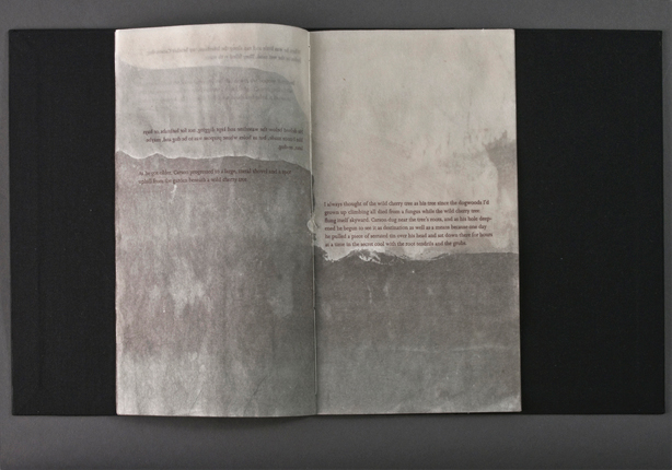
emily dyer — university of utah |
lauren faulkenberry — university of alabama
|
lauren faulkenberry — university of alabama
|
lauren faulkenberry — university of alabama
|
kyle holland — memphis college of art |
kyle holland — memphis college of art
|
JILL KAMBS — UNIVERSITY OF IOWA |
hannah evan leggoe — MEMPHIS COLLEGE OF ART
|
marie provence — MEMPHIS COLLEGE OF ART
|
marie provence — MEMPHIS COLLEGE OF ART |
SONJA GREENTREE ROSSOW — UNIVERSITY OF ALABAMA
|
elizabeth sheehan — memphis college of art |
tatiana shukhin — corcoran college of art and design |
tatiana shukhin — corcoran college of art and design
|
JANA SIM — COLUMBIA COLLEGE, CHICAGO |
JANA SIM — COLUMBIA COLLEGE, CHICAGO
|
JANA SIM — COLUMBIA COLLEGE, CHICAGO |
emily swales — memphis college of art |
/ / / / BACK TO SASC
/ / / / ARTBOUND HOME
/ / / ARTBOUND 2010
/ / / ARTBOUND 2012
/ / / ARTBOUND 2014
|
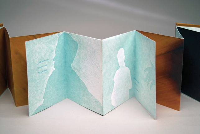
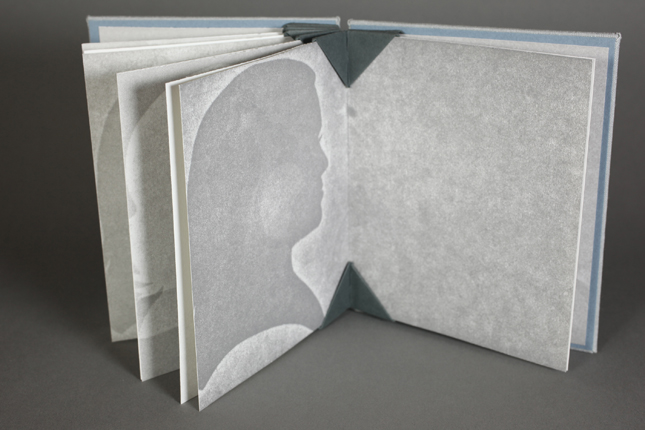
BROTHERS
Letterpress printing, pressure printing, digital printing
4.5 x 5.75"
Edition of 6
The book “Brothers” deals with the ephemeral nature of close human relationships. Through the imagery of silhouettes and cast shadows along with the accompanying text, the book contemplates the duality of absence and presence in the feelings that surround memories of important people in my life. While the hand cut silhouettes of old friends speak to absence, the text lists concrete objects that are physical remnants of a person who has left my life.
“Brothers” was created through a process of pressure printing and polymer plate letterpress printing mixed with digital printing and photographic imagery bound into a sculptural structure.
|
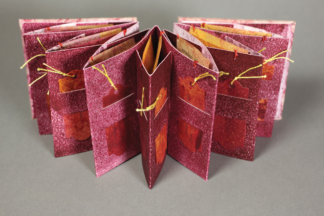
•• 2nd PLACE WINNER ••
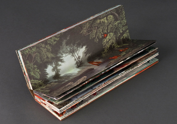
OF ORANGE
India ink paintings on found vintage lithographs bound in a stiff-leaf structure on conservation board with cloth hardcover and cover inset.
3.5 x 9 x 2.75"
Edition of 1
The concept of this one-of-a-kind artist’s book is straightforward: human elements in found pastoral lithographs have been covered over by orange ink. But since the bright hue of the color orange both highlights and negates man’s role in the landscape, the images take on a layered meaning and seem self-conscious of their erasure. Sequence creates a visual narrative in Of Orange; the images move through the seasons to explore themes of land use, landscape alteration and representation, and the false duality between the city and the country.
|
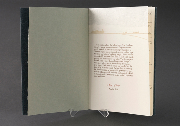
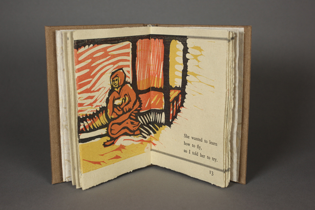
A DIARY OF DAYS (Honorable Mention)
Pamphlet binding with decorative sewing. Images are Sandragraph and linoleum; the handwriting is printed from photopolymer plates. Text is handset Baskeville metal types on Mohawk Superfine. Covers are flax UICB Case Paper.
7 x 5"
Edition of 25
With text compiled from the diary of an Iowa farmwife, this book explores the narratives projected on found objects and the growing nostalgia for Midwestern farm life. Found at a property auction, the diary contains 14 years of a woman’s life—from 1939 to 1953—in brief entries. A Diary of Days pulls poetry out of these entries, locating themes and beauty in the writer’s plain, domestic language. Direct excerpts of the diary in the form of images of handwriting are printed alongside the culled text set in metal type. As A Diary of Days progresses, the handwriting appears to be erased by time or overshadowed by the imposed narrative of a modern-day reader. |
HOLES
Eight-page pamphlet structure enclosed in a cloth Japanese portfolio with embossed title. Essay by the artist handset in Johanna metal types with hand painted Sumi and India ink on partially waxed Japanese paper.
10.5 x 5.75"
Edition of 25
The short essay in Holes is about the artist’s younger brother’s relationship with digging holes in the yard when he was a child. Carson’s holes, like many youthful games, start out as innocent experiments but end up being repurposed in ways he never could’ve anticipated, and they give insight to what kind of man he will become. Visually, the way the text, wax, and ink move down the page, accumulating weight from behind as the story progresses, mirrors both the act of digging a hole and the gathering of experience that can occur in our own backyards.
|
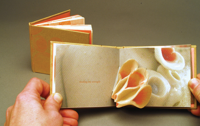
BURROWING
Digital and letterpress printed from photopolymer plates on Somerset paper with pop-up elements.
4.125 x 3.5"
Edition of 9
The concept for this piece titled “Burrowing”, deals with the relationship I have with my son. The first book in this two volume set edition discusses a feeling of being drained by the demands of motherhood. I am using images of my own ceramic works as a metaphor for my body. The text in relation to the images represents the symbiotic relationship of mother and child. The second book illustrates the struggle I feel while attempting to balance the time I need to myself and the time I spend with my son, and the fear of losing my bond with him in the process.
|
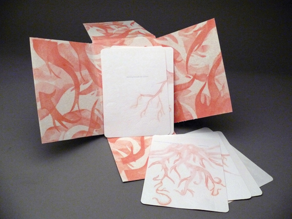
REACHING
handmade paper sheets with pulp painting and line bleeds, letterpress printed, housed in a handmade paper folio with pulp painting on the interior.
7 x 5"
Edition of 5
Reaching discusses the feeling of being pulled under by the demands of motherhood. In this piece I use the roots of a mangrove tree as a metaphor for myself. The text, in blue, suggests the surface of the water.
|
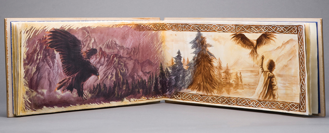
ARE YOU AFRAID OF THE MOON (Honorable Mention)
Handmade book with stiff leaf binding, pyrographed wood cover, digital and hand-painted water color combination.
19.5 x 8.5"
Edition of 1
|
SANCTIFICATION
Rives BFK, Masa, Assorted handmade papers from Nepal. Handset type. Letterpress Printed.
3 x 3 x 1"
Edition of 10
I grew up in a small, southern California town with a lot of fruit trees. I’ve always been interested in fruit as a symbol of love and experience. The red of the pomegranate, and the seeds crammed inside are a vision to me of love, of hope, of faith. Especially the kind of moments of love, hope and faith that bind a marriage together—and make the individual more holy. The structural text of the poem is pulled in pieces from the outside of the book, while pieces of auxiliary text exist in the hollows of the star-shaped center.
|
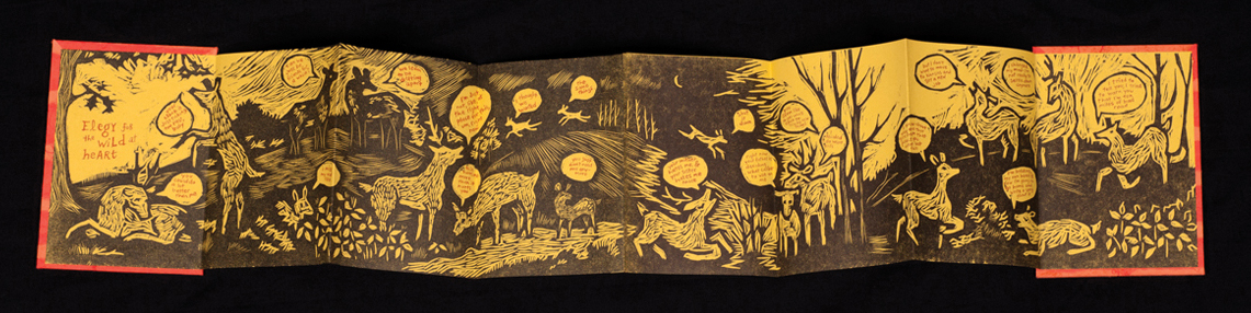
ELEGY FOR THE WILD AT HEART (Honorable Mention)
Letterpress printed with micro-density fiberboard and photopolymer plates. Accordion structure.
4 x 5.75 (closed); 4 x 32" (open)
Edition of 35
Elegy for the Wild at Heart is a playful look at the truths that people squeeze from each other as they flee from various forms of love and commitment. In this narrative, a herd of deer are speaking to each other, repeating the break-up lines and excuses that they have seemingly overheard from their human counterparts. |
MIGRATION: A FIELD GUIDE TO LOVE THAT WAS AND MIGHT HAVE BEEN
Letterpress printed with carved polymer plates. All papers are handmade by the artist.
5.5 x 8"
Edition of 45
Written and illustrated by Lauren Faulkenberry, Migration is comprised of two narratives. One is a collection of anecdotal stories that allude to romantic encounters that the narrator experienced or imagined. The other is based on observations of bird behavior that mirror the habits of the narrator. The result is a tongue-in-cheek look at the patterns that emerge between the speaker and her avian counterparts.
|
GALVANIZE
Letterpress printed with woodcut reductions, printed on a single 18” x 24” sheet that collapses to 6” x 6”.
6 x 6" (closed)
Edition of 70
Based on the mythology of the Greek Furies, and the vengeance they sought for women who were wronged, this text explores how this vengeance might be manifested in what we perceive as love. Galvanize questions if we, as people in love, may bring this on ourselves as a form of self-destruction. |
COUPLED VOICES (Honorable Mention)
Watermark, pulp painting, line bleeding, and letterpress printed text on handmade paper, encased in a handmade paper portfolio.
5 x 7"
Edition of 5
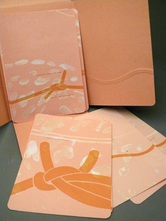
Coupled Voices, the first piece in a suite of two, records the moment when I met my father and the short-lived time thereafter. We are each represented by a piece of string, both of which come together to form knots that correspond to a particular occasion, but I specifically chose to incorporate the fisherman’s knot to symbolize my desire for our relationship to become impossible to untie. The iridescent spots in the background are abstracted views of the spots from the coat of a whitetail fawn deer. They represent my timidness when it comes to repairing my dysfunctional relationship with my father. |
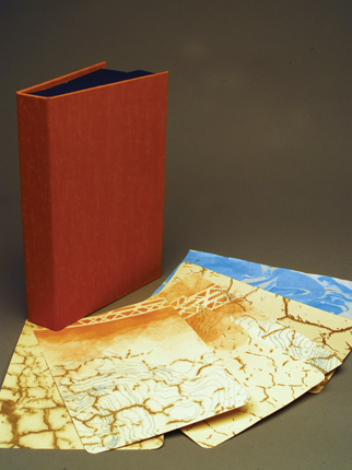
FORSAKEN SUBSTRUCTURE
Watermark, pulp painting, line bleeding and letterpress printed text on handmade paper, hand-marbled papers, housed in a clamshell box.
8.5 x 5.75"
Edition of 13
Forsaken Substructure uses cracked terrain, which represents the unstable foundation my relationship with my father began on, to portray the preclusion of a bond with him. The topographical mapping is a metaphor for the peak moments I had with my father and also references the water that revives the nutrient-lacking, cracked ground. The beginning of our bond and a constructive relationship is symbolized by the girder, which abruptly ends and causes the situation between us to reach a point of complete neglect. |
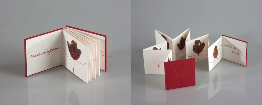
CORD
Accordion structure, hand-cut inkjet prints with decorative sewing on Arches cover paper; commercial bookcloth on cover with handmade polymer plate imprint.
3.25 x 3.25 x 0.5"
Edition of 15
Cord chronicles the life span of an autumn leaf as winter slowly drains it of vibrant pigment. The leaves are hand-cut pigment inkjet prints of digitally scanned leaves. Decorative hand sewing spells out the text of the book, stitches the leaves to the accordion, and visually links the sequence. The cord attempts to connect and repair, but in the transience of life, sometimes things break and fray beyond mending.
|
ROMANTIC
Handmade paper, letterpress printing, & clamshell box. Techniques include pulp painting, line bleeding, and watermark.
9.5 x 6.5 x 1.5"
Edition of 13
This piece focuses on the habit of romanticizing personal experiences. The artist used imagery that is present in multiple popular fairy tales in order to relate to a larger audience. The text of the piece is from the Grimm’s Fairy Tales, interspersed with the artist’s own words.
|
•• 3rd PLACE WINNER ••
CAMEO
Digital printing, letterpress, & pressure printing.
5 x 5"
Edition of 5
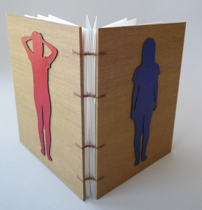
This work deals with the idea of losing a close relative. In Cameo I express grievance for the passing of my grandmother in a linear progression of memories and mementos from my time with her. The memories, however deeply impressed upon the pages, are fleeting shadows as time progresses. In Silhouette (see following page), my grandmother’s shadow and mine are repeated, occasionally making it difficult to trace which shadow belongs to whom. My memory of her life has ultimately impacted the individual I have become. |
SILHOUETTE
Pressure printing.
7 x 7"
Edition of 5
|
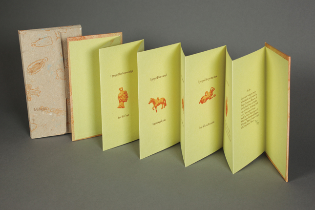
MILAGROS
Handmade paper, letterpress printed. Accordion structure.
5 x 25" (open)
Edition of 39
Over generations my family have been working printers or binders. The skills and love of this craft has come full circle with me. As an artist, I am dedicated to the creation of handcrafted limited edition books and prints. Because I am married to a military man, my work is influenced by my transient lifestyle and also inspired by my surroundings. Each work of art is letterpress printed on handmade paper that reflects the subject. Text, images, and paper are then bound in a cohesive form that engages the reader.
|
TIES
Clamshell box, kitakata and handmade paper with pulp painting, line bleed, watermark, etching, handset type, polymer plate, letterpress printing and suminagashi marbling.
5.75 x 8.75"
Edition of 12
My work explores the complex evolution of a tense relationship. I express this with the imagery of a knitted garment that has frayed and deteriorated over time, eventually becoming a tangle of threads and knots. This remnant of knitted material personifies the close, warm relationship once shared. The deterioration and unraveling of the remnant suitably correlates to a now diminished bond, while the knotting of the unraveled strands expresses and explores my futile attempts to mend that relationship.
|
TRANSLUCENT AIR
Letterpress, linocuts, tooling on a cover.
5 x 3.5"
Edition of 32
Translucent Air is about exploring the timeless connection that exists between the nature and us, the human beings. When left one-on-one with nature, what is it that we feel? What goes through our minds when we are alone in a vast forest, a field up in the mountains full of wild flours, a secluded lake? And what do these moments mean to us as artists? |
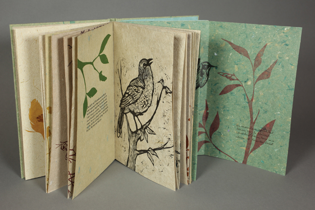
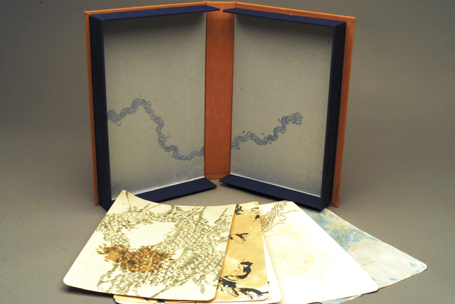
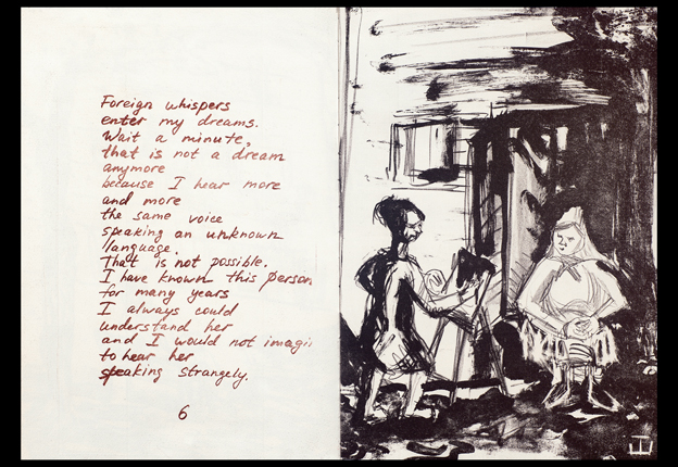
MURMURS
Stone lithographs (images), pronto-plates (text), letterpress on cover, handmade paper on cover.
11 x 15.5"
Edition of 12
Murmurs is printed entirely using stone lithography for images and with text printed from pronto-plates. The images are my present day recollections of my childhood. The text in this book is inspired by hearing all the different languages around me where I now live. |
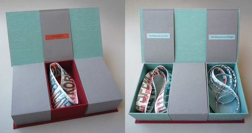
•• 1st PLACE WINNER ••
LANGUAGE MOBIUS
The three mobius strips were letterpress printed using polymer plates on Somerset, and the box is made in Jacob’s Ladder structure.
10 x 5 x 3"
Edition of 25
Language Möbius is about my speaking process.
The loop in my brain goes like this: hearing English, thinking in Korean, translating, then speaking in English.
There are three Möbius strips in the box. One whole Möbius strip, one cut in half and another cut in half one more time. With the first cut, the ring becomes twice as long. The second cut makes the two rings linked together. With each cut the sentences of the layers are also cut in half, making it illegible. The final two rings lined together symbolize the two languages tangled up in my head while in translation, which is why the sentences can’t be read.
|
METER (Honorable Mention)
inkjet printed on Somerset Velvet then laser cut and bound in single page coptic binding with plastic cover and leather.
6 x 9 x 1"
Edition of 15
Meter is about how I feel when I read something that’s too difficult. Many required readings as part of my studies in the Interdisciplinary MFA program at Columbia College, Chicago were very difficult for me to understand. Each page shows my stress level rising gradually.
The English words and information pile up to the point where it feels as though my brain can’t take this anymore. I took the outline images of myself gradually changing color as the stress gauge increases.
The words inside the body are laser-cut backwards and are readable from the back of the page. They describe how I feel at each stage, as my distress becomes greater and greater.
|
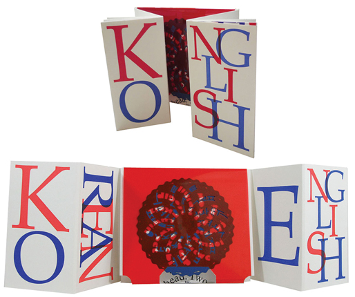
KONGLISH
Combination of two existing forms: the Drum leaf and Dos-a-dos, letterpress printed on Somerset, laser cut on Canford paper and Grafix Clear-Lay acetate.
8.5 x 7.5 x 1"
Edition of 32
This book is about the differences between how language is observed and interpreted. My focus is on three languages which are Korean, English and Konglish (Korean + English).
There are short, humorous stories in each language that I have personally experienced based on the differences of the languages and how they function in different cultures. How Korean appears to English speakers and how English appears to Korean speakers is different and sometimes led to funny mistakes and experiences causing misinterpretation or confusion. |
VACANT
Digital photography and letterpress printing
5.25 x 6.25"
Edition of 5
The series contains two handmade books contained in a clamshell box. The book entitled Vacant shows a contrast between social classes, emphasizing the relationship between those who have much and those who have little or nothing. The viewer, as they journey through the book, is confronted by bright white pages of fine china matched with the stark realization of their emptiness. Reflect is the title of the second book in the series. It tells a narrative of someone who once had it all and is now left with nothing.
|