/ / / / BACK TO SASC
/ / / / ARTBOUND HOME
/ / / ARTBOUND 2010
/ / / ARTBOUND 2011
/ / / ARTBOUND 2012
|
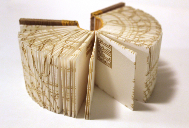
ECHOES
42.8 x 3 x 3.5”; 240 pages, 30 Sections. Two needle Coptic sewn on wooden boards and Coptic end bands. Laser cut sections, laser engraved edges and covers. Johannot mould made paper, wooden boards, and linen thread. 2014. Edition of 15.
“I made this book to document the words that repeated in the streets of Cairo during the Egyptian Spring of 2011 when millions of protesters from a variety of socioeconomic and religious backgrounds demanded the overthrow of the regime. The people repeated the three words: Bread [livelihood], Freedom, and Social Justice. I used Arabic Kufic script and spelled the words “Eish, Horeya, Adala Egtemaeya” —Bread, Freedom and Social Justice. The words are repeated over and over in different ways on the 30 sections. The book is an effort to remember and reflect on these events. It also serves as a reminder for the revolution’s main demands. Additionally, the book incorporates details of Cairo’s streets on the front and back boards. Cairo’s map is also laser engraved on three edges of the book.
|
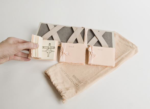
PAS DE TOIS
Letterpressed linen, elastic, ribbon, and three flip books with inkjet prints. 12 x 4” (small books 3 x 2.25”). Edition of 10.
Pas de Tois is an artist book inspired by past experiences and extensive study of the art-form, ballet. Materials, inspired by memories of wearing pointe shoes, encase three flip books in which an animated drawn ballerina performs three typical routines of a ballet class. The repetitive viewing of these flips books iterates the dedication and discipline that is vital to the practice of ballet and also alludes to the artist’s nostalgia associated with the dance form.
|
•• 2014 HONORABLE MENTION ••
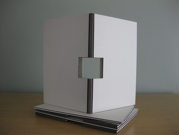
STOPPING PLACE
Letterpress printed from handset metal types and photopolymer plates, Mohawk paper,
die-cut window / 7 x 10” / Edition of 85.
In Italian, the word stanza means “little room” or “stopping place.” For this project, the stanza became a place to explore the relationship between reader and poet, body and space, sound and body, space and sound, language and location. How do we (or can we) locate ourselves using language or sound? Is it possible to meet you in these little rooms?
The bars that punctuate the poems impede reading and constrain you at the same time the poems and the book expand the room around you. The architectural lines accompanying the poems and the window in the book’s center hold the reader in and at the same time extend the book’s interior outward into “this” room.
The stanzas and the book itself cleave us/together. We are separated by the same structure that joins us, just as the walls of a house separate and join rooms.
|
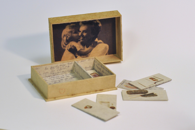
JEUX DE MEMOIRE (Memory Game)
Thai traditional Unryu paper, Lamali Lokta paper, Kitakata paper, cotton thread, book board; simple box with divider; hand-stitched embroideries, digital prints. 6 1/2” x 4 1/2” x 1 5/8”. February 2013. Edition of 1
Jeux de Mémoire (Memory Game) functions as the embodiment of the abstract act of compartmentalizing memory. More specifically, this work explores what information is preserved and what information is lost or eroded in the process of “putting away” a moment or thought, as well as the nostalgia all too often experienced with this process. The juxtaposition of hand-sewn details with digitally printed images further contributes to the exploration of this subtle and sentimental tension. Neutral color palettes, and repeated patterns and elements throughout Jeux de Mémoire capture the sensation that there is much to be remembered within this moment, but that not all details can actually be recalled. All at once, and while ultimately inevitable, the degradation of a memory can exist as beautiful, engaging, and empty.
|
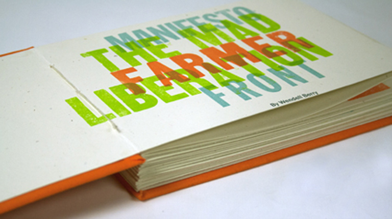
THE MAD FRMER LIBERATION FRONT
8.75 x 6” / Edition of 12
The Mad Farmer Liberation Front illustrates Wendell Berry’s poem Manifesto: The Mad Farmer Liberation Front. Each page features a variety of letterpress techniques from traditional wood block printing to pressure prints created from found objects. The book was printed on a Vandercook 4T press at Mississippi State University and features Gothic and Gothic Condensed wood and metal type.
|
•• 2014 SECOND PLACE WINNER ••
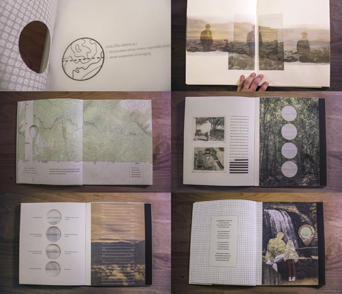
CONFLUENCE
Digital inkjet printing, Perfect bound book with die-cuts / 10 x 12” / Edition of 5.
Confluence is a highly personalized project—the result of a collaboration with another designer over a 5 week period, exchanging writings and art work. The result was this book, in which I explored relationships of family, friends, and loved ones, in conjunction with features of nature and cartography.
|
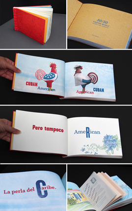
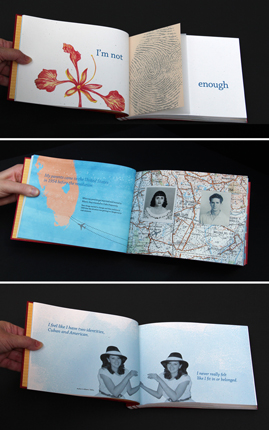
50/50: FINDING MYSELF WITHIN TWO CULTURES
Digital inkjet printing, linocuts, stab binding / 10 x 8” / Edition of 5.
Growing up in Miami, Florida, I always felt like I did not belong. As a second- generation American, born in America with Cuban parents, I felt I was neither Cuban nor American. Growing up in Miami, Cuba was present in my every day; in the home, at school and at play. The feeling of otherness was always there and when I moved away, the feeling was more evident because didn’t have similar people around me. I realized just how Cuban I was. As I grew older, I longed for a stronger connection to my Cuban heritage.
The structure of the book is, in essence, a book within a book, where the main focus is my personal narrative, with excerpts of stories revealed during interviews with other Cuban-Americans as tip-ins. The tip-ins add layers of meaning, validate my feelings and engage the reader. The book demonstrates the complexities of identity and how important place, memories and belonging are to forming our identities.
|
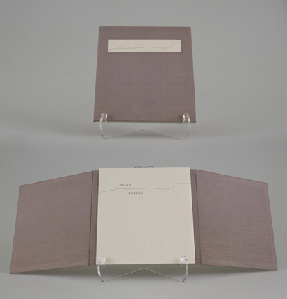
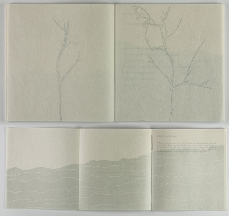
TRACE, DELUGE
Letterpress printed artist book using monotype and hand-set Garamond, images from linocuts and polymer on Kozo papers, sewn in a Japanese Multisection Binding, and enclosed in a Japanese portfolio. 6.5” x 7” x 0.5”. Edition of 30
Trace, Deluge focuses on the relationship between humans and the natural world by examining the tension between organic lifecycles and human cultivation, control, and constraint of the environment. Both text and image trace environmental movement, contrasting nature’s cyclical and regenerative qualities with humanity’s capacity for destruction and obsolescence. The poems, which alternate between two series, Trace and Deluge, are aesthetically mirrored in alternating imagery. Trace images were printed with photopolymer from shadow tracings drawn from the autumnal equinox through the winter solstice of a Celastrus Scandens specimen located at 41.40ºN, 91.31ºW. Printed on separate layers of translucent paper, these images document the change in light as well as physical form of the subject over the course of the season. Reflecting cycles of growth and decay, traced layers build in number and complexity at the climatic mid-point of the book and diminish to a single, spare layer in the final poem. The imagery accompanying the alternating Deluge series references a chart produced by the National Oceanic and Atmospheric Administration of the Mean Sea Level Rise from Tide Stations and Satellite Altimetry from 1870 to Present Day. Imitating this staggering sea rise, the wave-like gray, blue linocuts increase in size throughout the book. In this work, text traces a pattern of human ruin, which gives way to natural restoration, while imagery traces water and light as instruments of nature’s cleansing and reclamation.
|
•• 2014 HONORABLE MENTION ••
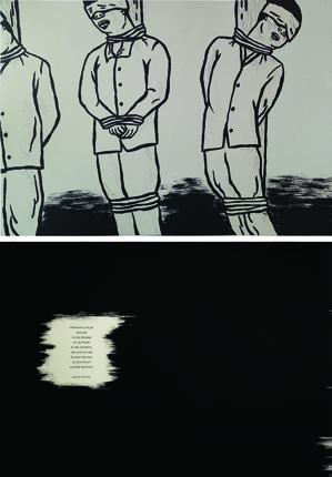
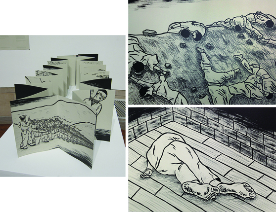
you are with me
Lithograph, pronto plate, and letterpress printing processes, drum leaf binding / 9.75 x 14 x 1.25” / Edition of 10.
In Korea between 1945 and 1953, many radical choices were made to stabilize the political situation. The first president, Syngman Rhee, used extreme measures to secure his power by removing any opposition, communists or non-communists. Estimates as high as 300,000 people were falsely accused, imprisoned, and executed. They were taken to hills and mountains, shot, and dumped in ditches. Two of my grand uncles were victims of being falsely accused and executed. This book is about the mass killings of innocent people during the tragic time in Korea.
|
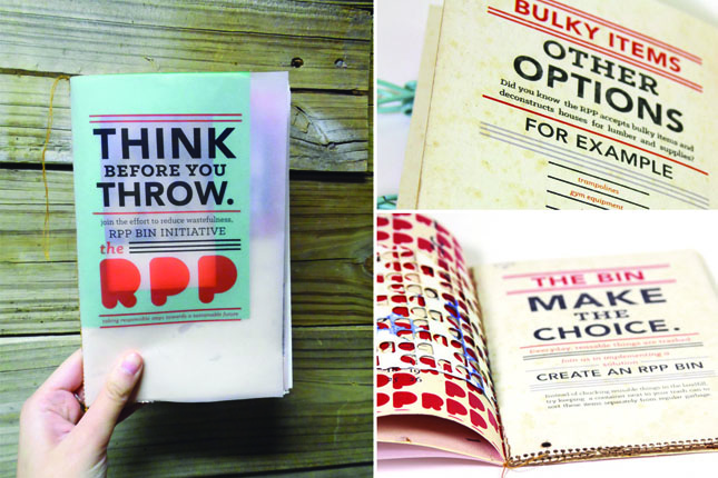
THINK BEFORE YOU THROW
Digital inkjet printing, single sheet pamphlet / 6 x 9” / Edition of 5.
“Think Before You Throw” functions as an informative mailer and an artist’s book made for a local nonprofit organization called The Repurpose Project. It is part of a larger campaign to address wasteful garbage habits and promote the use of found materials for art making. All materials used are from The Repurpose Project, a local source of collected recycled materials.
|
•• 2014 FIRST PLACE WINNER ••
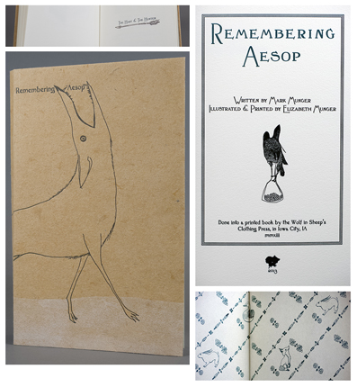
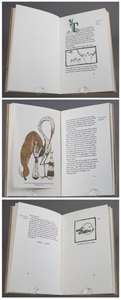
REMEMBERING AESOP
Hand-printed Artist Book, 2013. Written by Mark Munger. Illustrated, designed, and printed by Elizabeth Munger. 6”x9.75”. Reductive linoleum and photopolymer printed on a combination of handmade UICB Chancery, Cave and Hahnemühle papers.
Remembering Aesop is a collaborative book in an ongoing series of work exploring connections between animals, humans, and myths. In this book my brother, Mark (the writer), and I reexamine the Aesop’s fables of our childhood as a way of looking at the past and present and how memory changes stories.
|
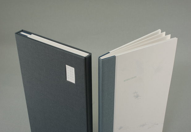
SEVEN CASES
Letterpress-printed from metal type, with drawings from photopolymer plates and collage. Each book is bound in a sewn boards structure and housed in a three-flap portfolio.
Edition of 40
Seven Cases is an edition of forty books that documents several visits to relatives in the city of Prague over the last decade. Both abstract and identifiable drawings of the city break apart and build off of one another, in order to emphasize the fragmented nature of the visits. The pacing mimics the act of walking, and depicts the shifts in mood as one moves from neighborhood to neighborhood, from inner city to outskirts. The title, Seven Cases, refers to the complexity of the Czech language and the difficulty that many English speakers experience with its seven grammatical cases.
|
•• 2014 THIRD PLACE WINNER ••
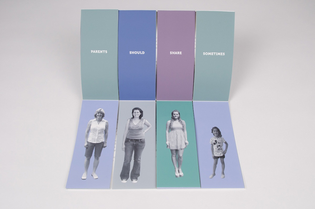
MIX AND MATCH FAMILIES
Digital photographs inkjet printed on Epson Ultra Smooth Fine Art Paper / 9 x 15 x 1”
Edition of 25.
In the USA, family is flexible and fluid. It is constantly changing as our society grows and develops an understanding for the people who live within it. This fluidity is essential and what I wished to explore. Mix and Match Families is an artists’ book that address these ideas. The imagery for the book began as I photographed families and individuals in Washington, D.C. I removed the original background from the images and placed them on solid colored backgrounds. The colored backgrounds indicate the original family unit in the artists’ book. The book is designed so that the viewer can flip through the pages altering the family (much like a children’s flip book) to include same sex families, heterosexual families, inter-generational families, and interracial families.
|
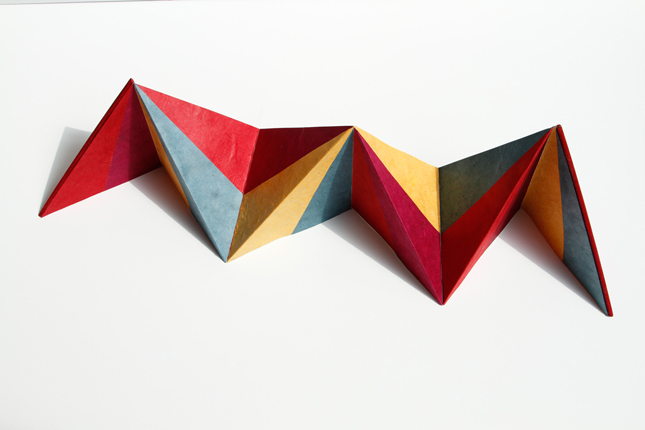
CONTORTION
Digital inkjet printing, rice paper / 5 x 5” / Edition of 5.
Contortion is a triangular accordion book with inkjet printed type, collaged rice paper and hardback covers. The narrative relates a contortionist’s performance to a coming-of-age experience. The book structure resembles a pitched tent while its typesetting and reader interaction simulate acrobatic movement.
|